Revitalizing the Getir App: Elevating User Experience through a Visually Stunning Redesign
Getir

The Challenge
This challenge consist in redesign the interface of a popular mobile App called Getir. The App’s design was quiet outdated, so I was in charge to give it a new look that can reflect the App features.
Field covered
Tools Used
Figma
UI
I start this project having a look at the App I normally use. I had in mind an App called Getir, it is a functional and popular App here in London for order and home delivery of grocery in the same day.
I personally had use this App before and Honestly I didn’t particularly liked the UI part, specially the colours, so I found an opportunity to change it, making it more appealing.
The original Getir App:
Introduction


Cloning
Exercise
The first exercise for this project was reproduce 5/6 screen of the original App. The job was not hard by itself but it took me sometime just because I wanted to recreate every component of the original App. Look a time consuming process but I noticed that after I finish this my work was going faster and smoothly as I didn’t have to create a new button or section for every page.
Research
Visual Competitive Analysis

My second step in the project was conduct some visual competitive analysis. To do this I had a look at the main competitors, doing this I noticed how their colors was much more appealing and give a more professional taste to the App. I also could see how their design looks modern.
Main Competitors: Deliveroo; Uber Eat.
While I progress with the research this I also try to get some inspiration from this competitors, I in fact liked some buttons design and design structure of the check out page.
Define
Mood-Board
I then gave some attribute to the brand I was working with.
I wanted my brand to be:
Fresh
Fast
Friendly
Professional
Reliable
Modern


Define
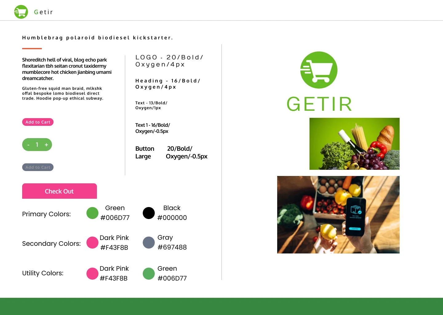
Style-Tile
The colors are also decided, I got 2 different colors pallet but one in particular was inspire me the most, so I decided to go for green color as primary color, with a white background and pinkish buttons.
To me this was the right choice as the pink color was well visible and intuitive as an action button.
For the typography I also had to try different font and one stood up above the others, for the font I choose : Oxygen. This font looked to me clean and understandable, so I done some trial with different size and font style to create the typography that will be in the style tale together with the colors and the most important element of of the add design.

I then proceed creating all the different component for the final app design, also this took me some time but I manage to finish it and the rest of the work was much smoother.
While I was redesigning i got some inspiration from the competitors, for example I liked the button’s look in the Uber Eat App so I decide to integrate a version of those.
Ideation/Final Screens
Style-Tile
The first thing I redesign was the home page that in the original design was looking very busy, so I decided to fit the categories in bigger shapes and I also try to space them in a way that it will look more organised and understandable;
I also decided to change the style in the product page, if before the products were presented in lines, now I decided to present it in a single scrollable column, also now we can notice as I moved the cart in the top right corner of the App, this is giving more space in the Navigation Bar where now we only find 3 buttons: home, profile and search;
In all the screens the purple button is indicating and action that is Add in the Cart or completing the order with the check out. The green action button instead is used to add in quantities the product of choice (this was not present in the original App);
In the check out page I also tried to keep a more modern look, specially when we select the payment method.

Conclusion/What’s Next
The hi-fi screens look more fresh and modern than the original app, so I am pretty satisfy about this job.
I am also aware that there are some aspect of the design I can improve, such as the basket page, I would like to redesign it making it more complete adding a better feature for delete an unwanted item and also add some more details before the subtotal like various discount.